A Pictorial Blog of Things I Make,
Items I Collect, Architecture I Love,
and Other Stuff


Tuesday, May 10, 2011

N.Y.C. Business Cards With Out-of-the-Ordinary Contours

 There are rectangular and square business cards aplenty. The card above and the ones below don't fit that mold.

 With its die-cut spoon sprouting off the top and bottom, this is pretty much my all-time favorite card. Savoy, alas, will close on June 18 after two decades in business.

 The rococo card of three-month-old Buvette is a new fave. Shown are the front and back.

This card is genius: The shape echos that of a loaf of bread.

The same shape accords this card an Art Deco air.

I have come across a triangular card exactly once and this is it.

The front and back of the card for a Japanese-Thai noodle bar--thus the groovy lineation.

The only card I have with this shape.

Two rounded corners on a horizontally-oriented card . . .

and a pair of rounded corners on a card oriented vertically.

 This refined card has chamfered corners--the first I've ever seen on an N.Y.C. card.

 Round cards are not common but they're out there. Here's the front and back of one.

From 407 Park Avenue South, a card shaped like a leaf.

 This is the card for Country.

The ovoid card is a rara avis.

This is a teeny square card--for a restaurant at 1725 Second Avenue--and all its corners are rounded.

 The deckle edge of this card--for an eat place at 343 West Broadway--evokes a 1950s photo.

A rubber-stamped tag.

Another tag-shaped card--from The National.

 This card was dispensed sometime around 1981 from a Takacheck, a bell-clinging contrivance retained from the 1950s (and still in use today) when the Odeon's space was occupied by the Towers Cafeteria. The card is shaped like one of the meal tickets once used to keep track of what you chose from the cafeteria's steam tables.

 Here's another version of Buvette's enchanting card--in brick red. The illustrations on the back of this card reference food; the Buvette card at the beginning of the post, in navy blue, has images related to wine.

This is not a business card but a post card of Manhattan. Wouldn't its shape make a great card for a venturesome New York City outfit? 

Monday, May 9, 2011

Ten Mid-Cen Gems in Manhattan

Concrete columns splayed at the base, individual sections of glass curtain wall, a top section that projects provocatively--these are mod hallmarks that give the Harlem State Office Building a decidedly mid-century look. It was designed in 1973 by Ifill Johnson Hanchard and is at 163 West 125th Street.

From the mid-50s till the mid-70s, architects sought fresh forms for buildings--such as the one used here for the Lucile and Carl Oestreicher Community House, next to Temple Shaaray Tefila at 250 East 79th Street.

For two decades, a feverish preoccupation with new architectural articulations endowed Manhattan with scores of arresting buildings--including the Hagop Kevorkian Center for Near Eastern Studies at 50 Washington Square South. It was designed in 1972 by Philip Johnson and Richard Foster. 

At 433 West End Avenue, the Calhoun School Learning Center calls to mind a television set. It was designed in 1975 by Costas Machlouzarides.

205 Third Avenue: The sinuous marquee at Gramercy Park Towers dates from 1964.

44 West 62nd Street: 30-story Lincoln Plaza Tower (1973) by Horace Ginsbern and Associates.

37 West 12th Street: Butterfield House (1962) by Mayer, Whittlesey & Glass.

Hexagonal fountain in the forecourt of Butterfield House.

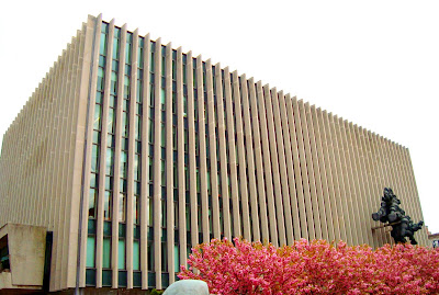
435 West 116th Street: Columbia University Law School (1961) by Harrison & Abramovitz. The sculpture by Jacque Lipchitz was placed here in 1977.

520 Twelfth Avenue: Sheraton Motor Inn (1960) by Morris Lapidus. Nowadays this is the Chinese Consulate.  

Central Park at the Harlem Meer: Loula D. Lasker Pool-Ice Rink (1963) by Fordyce and Hamby. 

Sky-viewing slits created by the origami-ish roofs of Lasker's concrete pavilion.

This is not one of the Ten Mid-Cen Gems but it sure could be. Evoking that bygone era of risk-taking design, the Standard New York by Polshek Partnership went up not 40 years ago but in 2009.

Monday, May 2, 2011

Red Doors of the Upper East Side

The Chinese consider red to be a propitious color, making it at an apt choice for the China Institute in America at 125 East 65th Street. Prior to Chinese New Year, doors get a fresh coat of crimson to attract good luck and well-being.

On a house of worship, a red door is supposed to evoke memory of the Saviour's sanguine fluid and signifies that the space behind is sanctified. The doors above are a side entrance of the Park Avenue Christian Church at 1010 Park Avenue
.
541 East 72nd Street, address of the late George Plimpton's apartment. I once enjoyed a 10-minute tête-à-tête with President Clinton here about his library in Little Rock--with him doing 90 percent of the talking.

In Ireland folks paint doors red to stave off malevolent spirits and ghosts, a tradition based on of Druidic superstitions. This door is at 182 East 75th Street. 

 Schools and barns were commonly painted red starting around the time of the Civil War because cheap, easy-to-come-by iron ore--ground fine--yielded the key ingredient for a pigment called Venetian red. These doors are at 45 East 81st Street.

According to the aesthetics of feng shui, a red door symbolizes the mouth of the home and draws positive energy to it. This door is at 16 East 81st Street.

When Model T's began to hit the road in the early 1920s--all of them painted black to make them as inexpensive as possible--fire departments started painting their vehicles red to stand out better. This fire station is at 157 East 67th Street.

During the era of the Underground Rairoad a red door supposedly represented a safe house. This door is at 126 East 78th Street.
A red door is also said to announce that a home is paid for, free and clear. Above is 326 East 69th Street, financial disposition unknown by me.

Albert Einstein painted his door red because he said he otherwise could not recognize his own home, which was not the one above at 216 East 70th Street.
At 406 East 80th Street are these doors that date from 1955 and were designed by Brown-Guenther-Booss for the Convent of St. Monica, patroness of those who have difficult marriages, disappointing children and--fittingly for New Yorkers--are victims of verbal abuse.
To look at similar posts on portals, visit: Art Deco Doors in N.Y.C. & Eloquent Opening Statements in N.Y.C.

Monday, April 25, 2011

The Most Seventies-Looking Seventies Stamps, Part Two

This 1971 stamp features the official logo for the nation's 200th birthday, designed by Chermayeff & Geismar.

The American Revolution Bicentennial Commission chose the logo from more than 100 submissions. The two stars symbolize the two centuries of the country's existence, and the free-flowing lines of the outer star, said the commission, "are intended to evoke a feeling of festivity and suggest the furled bunting traditionally used in times of celebration throughout the nation."

This is the logo Chermayeff & Geismar created for PBS around the same time.

This purple 1974 stamp pulsated as loudly as the disco music that the same year began to top the charts.

Flaunting bold Helvetica (then becoming the go-to type font), the stamp honored the year-one anniversary of the launch of the nation's first space station. In 1979, amid global Chicken Little-like anxiety if not hysteria, Skylab fell back to earth, raining debris into the Indian Ocean and onto Australia, where the municipality of Esperance fined the U.S. $400 for littering. (The fine has yet to be paid.)

Amnesia brought about by McMansions and SUVs eventually erased the effort initiated in the 1970s to conserve energy and implement cleaner ways to use it--solar being all the rage.

The stamp came out in 1977, shortly after President Carter created the Department of Energy.

The fun typeface known as Frankfurter--because the letters look like hot dogs--showed up everywhere in the '70s, including these stamps from 1974 to promote the code known as ZIP (Zone Improvement Program).

The cartoonish trains, planes and trucks mirror the Frankfurter type, which was created in 1970 by Bob Newman.

Newman also invented this popular font of the era--Data 70.

The down-home yet modern look of these 1978 stamps perfectly reflect the Peasant Chic look kicked off by Yves Saint Laurent in 1976.

The design the stamps was taken from a basket quilt made in New York City in 1875.

The '60s psychedelia of Peter Max spilled liberally into the '70s, as evidenced by this ten-cent stamp that commemorated the 1974 World's Fair in Spokane, Wash.

These stamps came out in 1973 . . .

. . .and were designed by husband-and-wife illustrators Naiad and Walter Einsel, whose work was very popular in the '70s.

This illustration by Naiad, also from the '70s, has the same palette as the stamp above.
To look at the first half of this post, visit: The Most Seventies-Looking Seventies Stamps, Part One